

In 2017, Canada will be 150 years old. For some reason, the government is already worked up about the birthday party. Aren’t we a bit ahead of ourselves? I mean, I’ll turn 26 in 2017, but I’m not busy planning that party yet, and I’m not commissioning artists to draw a logo for my celebration. Perhaps that’s a good thing, because the government recently revealed the logo it chose for the 150th birthday celebration, and it turns out, as with most things, it bungled the design process. Worse: Stuart Ash, the man who designed the logo for Canada’s 100th birthday, doesn’t like the new design.
Before selecting the new logo, the government paid $40,000 to commission firms to create a design. After deciding that none of these designs met their standards, Canadian Heritage ate our money and started again from scratch. The department organized a contest and offered a $5,000 prize to any student over 18 years old who could design the winning logo.
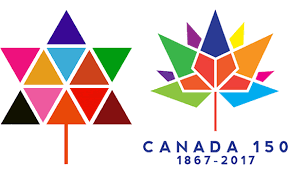
The new logo (right) is a rip off of Ash’s 1967 “masterpiece” (left).
Ariana Mari Cuvin
No one asked him which one is better, but Ash said that the new logo is worse than his logo because this one comprises 13 shapes to represent 13 provinces and territories instead of the 11 that he used to represent Canada’s 11 provinces and territories in 1967. He says this makes the new design look “complicated” and “confusing.” For those of us who can handle small numbers like 11 and 13 without complication or confusion, the problem seems much more obvious. The new logo evokes images of an exploding tree, pointy vomit, and Canada’s five major political parties; these aren’t things that make Canadians proud. The logo is at best mediocre.
It makes sense that Ash focuses on the number of triangles rather than the general quality of the design. After all, this logo looks eerily similar to his logo, which resembles the Star of David-shaped deciduous tree at a tie-dye party. Not that there’s anything wrong with that either, but it doesn’t exactly scream “Canada.” It’s worth noting that both designs are supposed to be maple leaves…who knew?
Despite similarities between the logos, the processes to arrive at them were completely different. In the 1960s, the government originally proposed a contest, but then contracted professionals when it didn’t like the entries, which were, in Ash’s words, “banal, predictable, and clichéd” (sounds like our winner!). In 2015, the contest followed the professionals’ work. Surprisingly, the results were nearly identical.
Recently, Ash lamented that “politicians are not in touch with the realities of the marketplace.” Canada’s affinity for oil at all costs suggests that Ash is probably right, and the results of the contest support his argument. A quick browse through the CBC gallery of the other designs entered in the Canada 150 contest shows that the government selected the worst logo from the available choices. Yet, while politicians may not be in touch with the realities of the marketplace, they are in touch with the reality of an impending election, and they are extremely well-versed in political advertising. Minister of Heritage Shelly Glover picked the winning design, and we can only imagine what her selection criteria were. Whatever, let’s infer. Notice that the winning design is one of only two to feature Conservative Party blue? It is also the only design that puts Conservative blue on top of the other colours, and the only one that does not feature bright, bold, Liberal red (which is, inconveniently, the colour of Canada’s flag and of an autumn maple leaf). So yes, this new design won this questionable contest fair and square, but it appears to have been a strategic victory: one that likely earned Ms. Glover “good job!” at the next Cabinet meeting.

Canadian updated version: My Super Sweet 150.
MTV, My Super Sweet 16
If any of this rattles you, strap in and prepare for a bumpy ride. Canada is set to spend $210 million on the 150th birthday celebration. That’s about $210 million more than I’ll spend on my 26th birthday. But that’s ok, Canadians number 35 million strong, so it’s really only six times what I’ll spend on a per capita basis. It’s reasonable. Unfortunately, if this contest tells us anything, Canada’s big party will also be 100% more partisan than my birthday party. There’s no good reason for that.